We want to start by welcoming you to Apartment Investor Pro. In this tutorial we will be showing you how to use the Visual Editor to customize the look of your website! Now there are 2 ways to use the Visual Editor 1st being from your website, which is what we’ll cover in this tutorial. Second is from your dashboard.
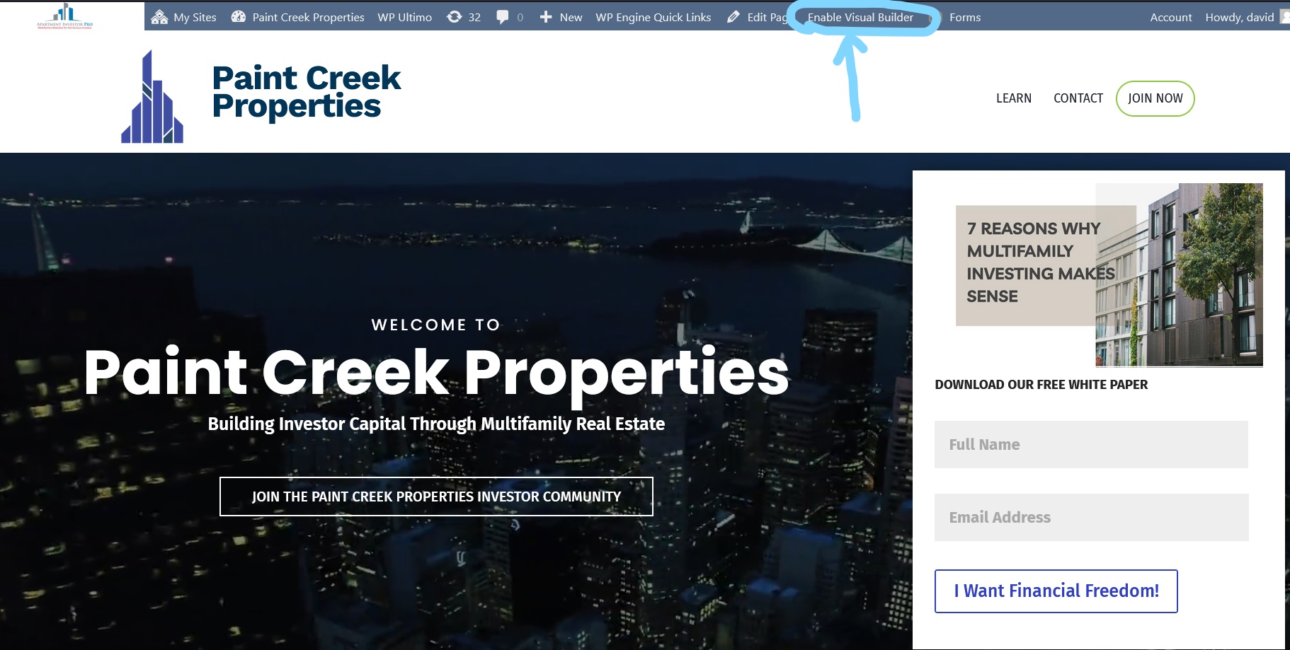
With that in mind the first thing you need to know is WHERE to find the Visual Editor. If you have logged in to your website through your domain you’ll see an extra menu at the top of the page. In that menu you’ll see a button saying ‘Enable Visual Builder’. Click it.

After clicking the button wait for it to Completely load. After which you’ll see new options appear on your website.
This may look confusing at first but in no time you’ll know how to work the Visual Editor like a champ. Now there many, many features you can use to change the look of your website. For now though I’ll show you the basics. To start hover over a section of text you want to edit, and another pop-up menu will appear displaying typography options we’re all familiar with. You can also add/change/remove text simply by typing away.
NOTE: These typography options are only available for paragraphs or text shown in the picture above. It does not work with buttons, menu items, logo text, forms and certain other text you may see throughout your website. If you’re unsure though try clicking on something you’d like to edit to see if you get a pop-up menu.
Sections, Row & Modules
How do Sections, Row & Modules affect your website? Simply put these elements are boxes that contain All the content on a page. Everything from the background, text, pictures, slideshows, forms, and the list goes on. Interestingly you can have multiple Modules within each other.
Note: The layout of these are always the same. With Sections being your main box. Your Rows sit inside Sections. And Modules sit inside Rows.
The blue option box are for ‘Sections’ and gives you options for editing the blueish background of that Section how you wish. You can add as many Sections as you wish to your page. Because Sections are your main boxes you cannot place a Section within another Section.
The green option box are for ‘Rows’. Rows are horizontal (left to right) strips of your page. You can place many Rows inside a Sections as you like. Each Row, can have anywhere from 1-6 columns of content and many variations in between.
Lastly the grey box is for specific content ‘Modules’, in this case there is only text. This grey box gives you the ability to change or edit what is in the Row. Modules make up 1 column of your Row. So if you choose a 3 column Row you can place 3 Modules.
Edit Options
As noted earlier each Module is represented by different colored option boxes. Most of these options are the same for every Module. From left to right these options are:
- Moving
- Settings
- Duplicating
- Saving to a library
- Deleting
Note:The secondary Module (the Row) has another option for ‘Changing Column Structure’. Which we will cover in a later tutorial.
Editing Content
Start by clicking on the ‘Gear’ icon in the grey option box. When you do a pop-up box will appear displaying text settings.
This gives you many more options for editing these paragraphs then simply clicking on the text as shown earlier. Near the top of this box you’ll see 3 tabs. Content tab is what you see in the above picture. Design allows for further editing of the text and paragraphs when it comes to the styling.
The Advanced tab you do not need to worry about unless you know what you’re doing when it comes to CSS. Feel free though to explore all these options! If you do not like what you added OR made a mistake and dont know how to fix it, simply click the purple back arrow which will undo what you just did or the red ‘X’ which will discard any changed you just made.
Saving Your Work
