This is a continuation of our previous article – How To Use The Visual Editor Via Home Page. Here we will go into a bit more detail of how to add and work with Sections, Rows & Modules. If you have not read the first article I encourage you to do so first as it explains how to activate the Visual Editor and some other basic functionality.

Knowing The Grid System
What is the the grid system? Simply put, a grid system is a set of measurements used to align and size objects within your website. It is also what allows the content of your website to scale up or down so it always looks good not matter the screen size. Knowing this is important because it is how your website is built.
To illustrate, lets say we choose we choose a Row with a 3 column layout and from left to right add some Text, an Image and Blog Posts.

Because of the measurement the grid system is built on, no matter what the browser size is your content will shift from a horizontal layout to a vertical layout to keep your website looking neat and professional. The last thing you want is for your users to have to zoom in on their mobile devices to view your content.

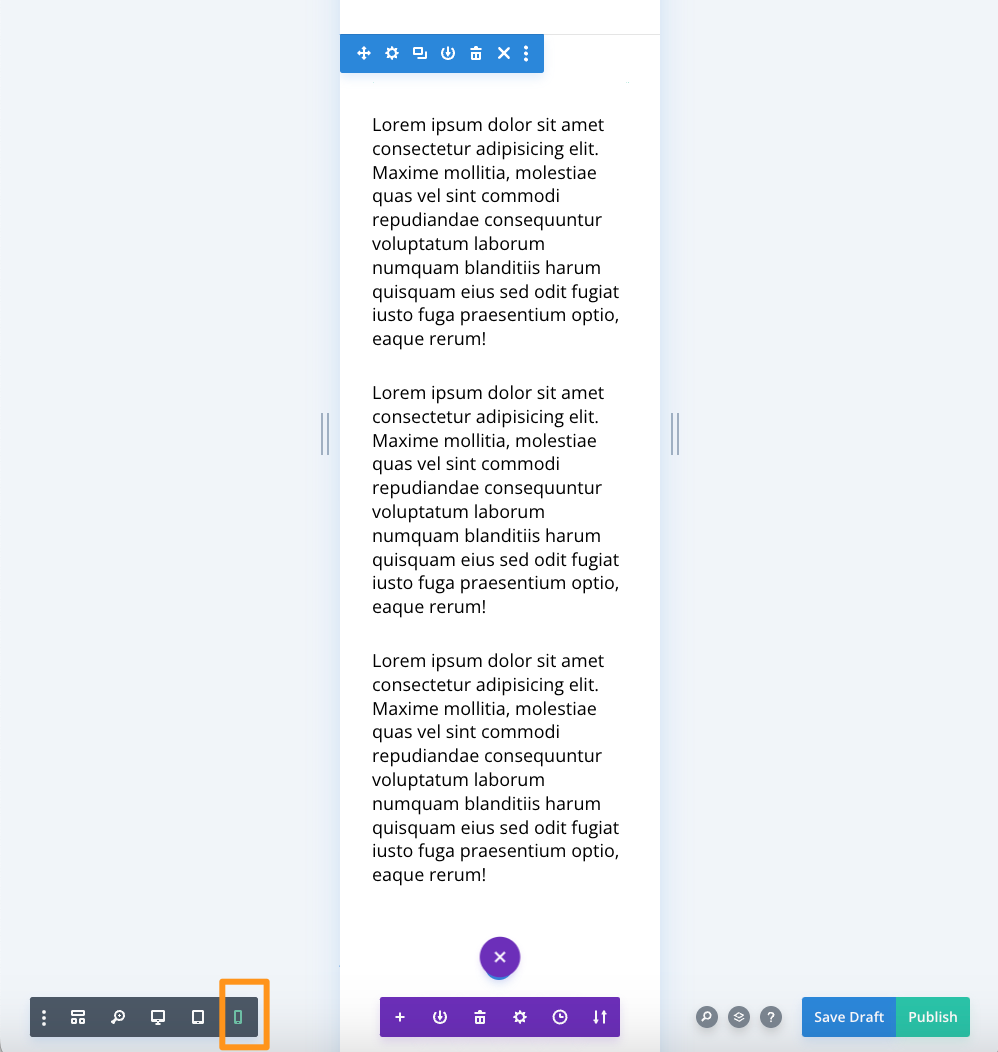
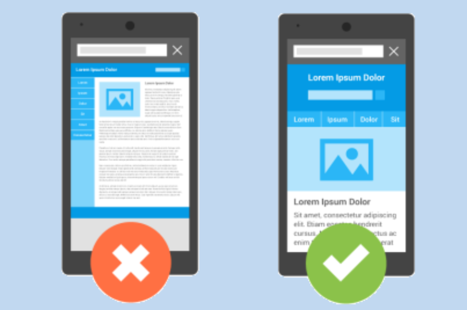
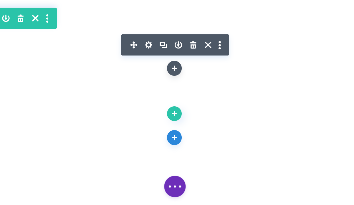
Don’t feel overwhelmed though, using the Visual Editor it makes it super simple to create a beautiful looking website using the grid system. With this in mind scroll to the bottom of your Home Page and you’ll see 3 colored circles corresponding with the picture below.
Adding a Section
We’re going to start with the outer most part of your content which is called a Section. And so as not to overwhelm you with to much information we’re just going to be talking about Sections in this article. To start go ahead and click on the Blue circle. When you do you’re given 3 options.

The first option is Regular. When you choose regular you’re given a list of different Row designs based off the grid system. The nice thing with Visual Editor it shows you how each row will be layed out. Ranging from a single large column all the way up to 6 smaller columns. And many variations in between.
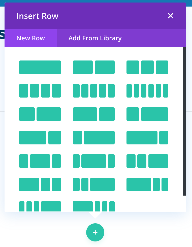
NOTE: All of these options are responsive. Which means your content will scale so as to properly fit every screen size. Also important to know, You can not split up your content into more then 6 boxes as shown in the picture above.
The second Section you can choose from is Specialty. This option is very similar to Regular except the layouts you can choose from are a bit more fancy.
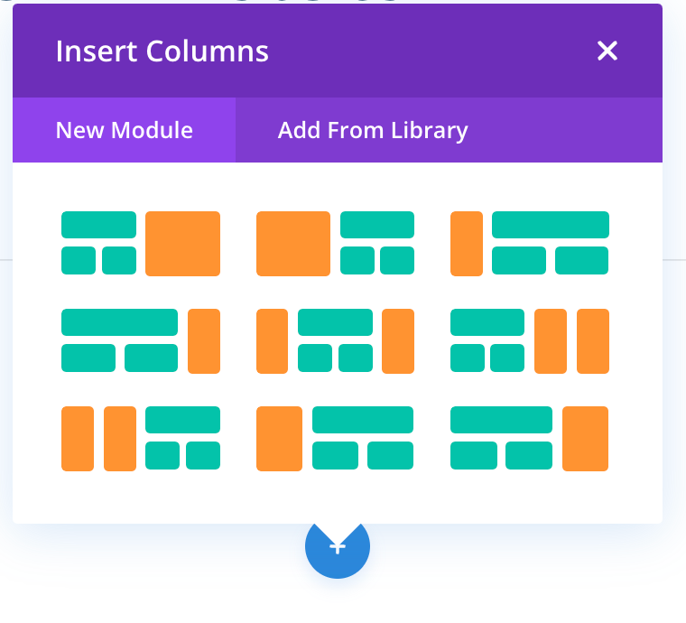
So the concept of how these options work are exactly the same as Regular, except instead of having your content in a single horizontal line, these layouts are split up in a way that you can have some of your content sitting on top of each other while maintaining a professional and responsive look. So really the choice is yours on how you want your content to be layed out.
Lastly is Fullwidth. This is rather self explanatory, instead of have many layouts to choose Fullwidth is a single Row that expands the entire width of the screen, no matter if you’re viewing the website on a desktop or mobile device. This option is good when you want to display important information, slideshows, important header text or for any content you want to stand out.
Saving and Deleting
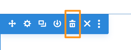
So feel free to explore the different options given to you. The great thing is if you do not like a layout you’ve chosen it’s easy to delete it. You can simple click outside the pop-up box presented to you or click the ‘X’ in the upper right corner. However when you do this the Section will still be there, though thats super easy to delete too. Just simply click on the garbage can icon to delete the Section
Once you do find a layout you like the next option you’re given is to select a Module. Because of the vast amount of options you’re given we’re going to cover that in another tutorial.
