PLEASE NOTE: To make things easier, your site may already have an ‘About Us’ page started. We provide a template you can use to make it quicker to set up your About page. You’ll find it under Pages. If you don’t have it, you can send us a message and we’ll add it to your site, or you can create your own if you like. All you’ll need to do is add it to your menu.
For instructions on how you can add this page to your menu, please follow the instructions in this article.
People considering working with you want to know who they’re doing business with. Having an effective “About Us” (or “Our Team”) page gives people a way to learn more about you and see the people behind your business.
You’ll want to have professional-looking photos for this. If you’re part of a coaching program, often your coach will let you list them as being an Advisor. But check with them first to make sure.
Using the Visual Builder makes it quite easy to create and style this page.
Getting Started
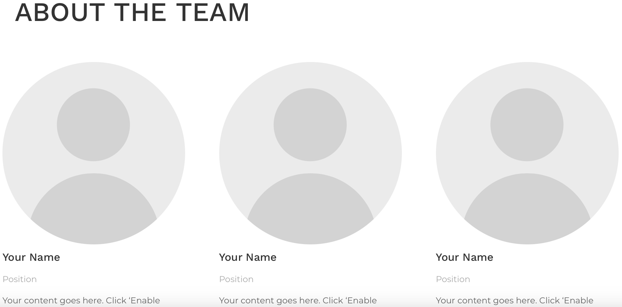
There are 2 layout options you can use for an About Us page. There’s a fullwidth option or you can display each team member in columns. Here’s an example of both options.
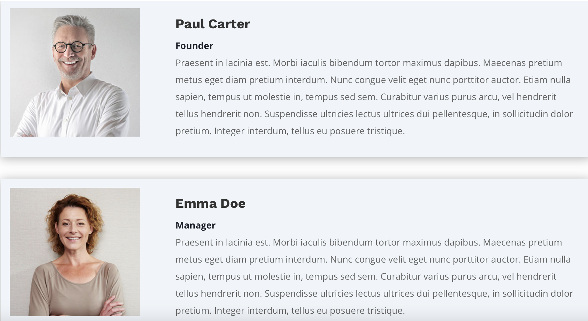
NOTE: Above is fullwidth. Below is in columns.
Fullwidth Layout
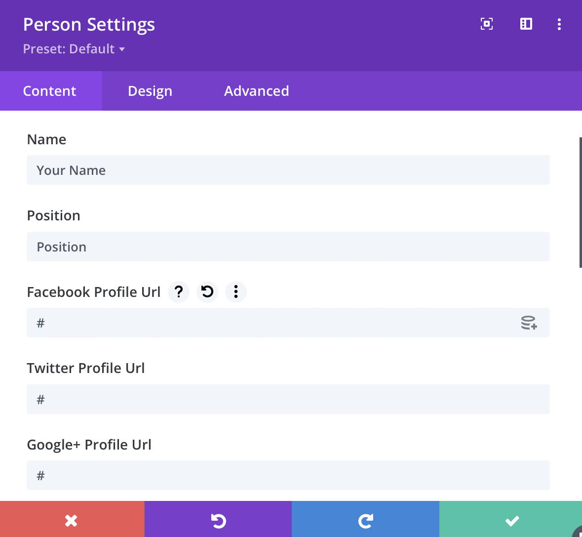
To create a fullwidth layout is very simple. All you need to do is enable the Visual Builder and select the ‘Person’ module. And that’s it!
By default the ‘Person’ module takes up the fullwidth of the container. So all that’s left to do is fill in the details.
Giving Your Section Some Styling
Once you have added the information about your team members the next thing you’ll want to do is add some styling.
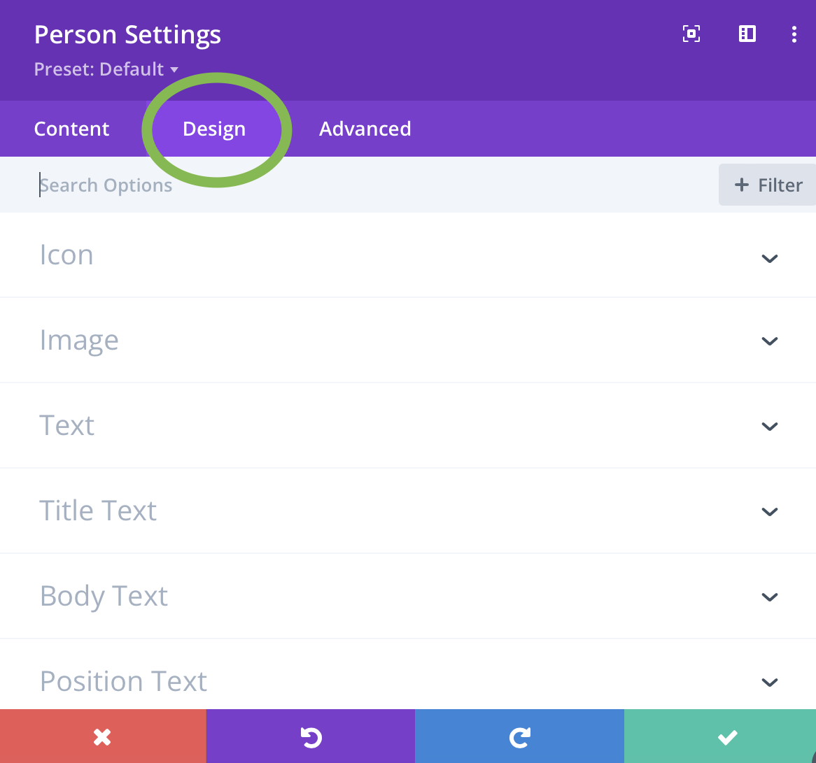
Navigate to the Design tab of the ‘Person’ module settings. Here you will find the design options for every section, from the image and social icons to the different text sections like their name, position and so on.
Icon Settings
Within the Icon settings you can adjust the size and color of the social media icons.
Image Settings
The image settings allow you to add border radius along with other basic image editing options. If you like the look of circle images over square then set the radius to 200px.
NOTE: In order to have circular images you must first upload an image that is square (e.g 450px x 450px). If it’s rectangular (e.g 450px x 550px) Your image will be an oval.
Text Settings
The different sections of text all have their own spots where you can add styling. Each of these sections have the same options. Text Font, Font-size, text color, letter spacing and so on.
Column Layout
To achieve a column layout you actually have to adjust the number of columns within the row because by default the ‘Person’ module takes up the full width of the column it’s placed in. This differs from the ‘Blog’ module were you can adjust the layout withing the module options itself.
To add styling works the exact same way as fullwidth layout.
NOTE: Use a 2 or 3 column layout for best results. Using 4 or more will look to squished.
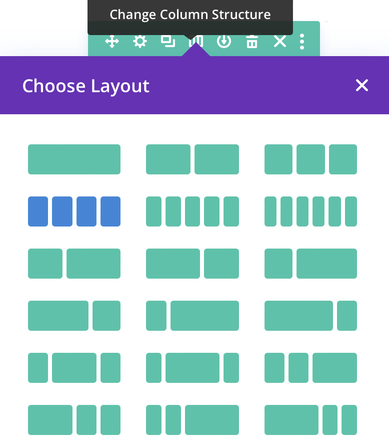
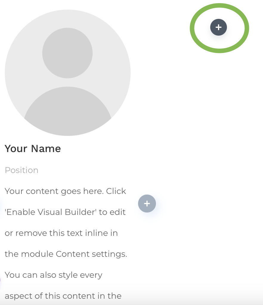
Once you change the number of columns you can click on the little grey circle icons to add more team members.
Our developers have made creating an About Us page even easier! AIP Pro plan and higher already comes with an About Us page ready and waiting for you to fill in the blanks. All you’ll need to do is add it to your menu.
For instructions on how you can add this page to your menu, please follow the instructions in this article.
If you need any assistance feel free to send us an email.
