The Visual Editor that comes with Divi has many easy to use Modules that let you add the content you want to your site. Each Module shares many of the same customization settings and options. In this tutorial we’ll go over the basic Module settings.

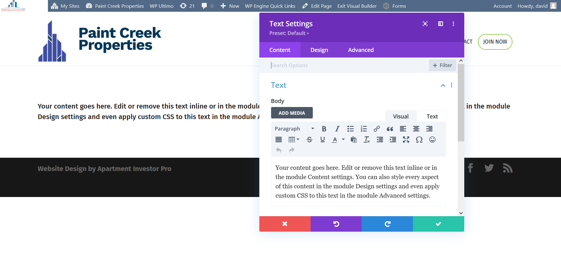
This pop-up contains ALL the functionality for any Module you choose. The layout will always be the same. We’ll analyze the main features you’ll most likely use.
Starting from the top is the Module title, in this case we’re looking at a Text Module. This title indicates the type Module you are working with.
To the right of the title are 2 little buttons. The first one on the left side allows you to Expand or Contract the size of your Module. The one beside that causes the Module to Snap To Left, meaning it’ll stick to the side of your browser.
NOTE: You control the exact size of the Module using the arrow in the bottom right corner. Or move it about by holding down in the purple area by the Module Title.
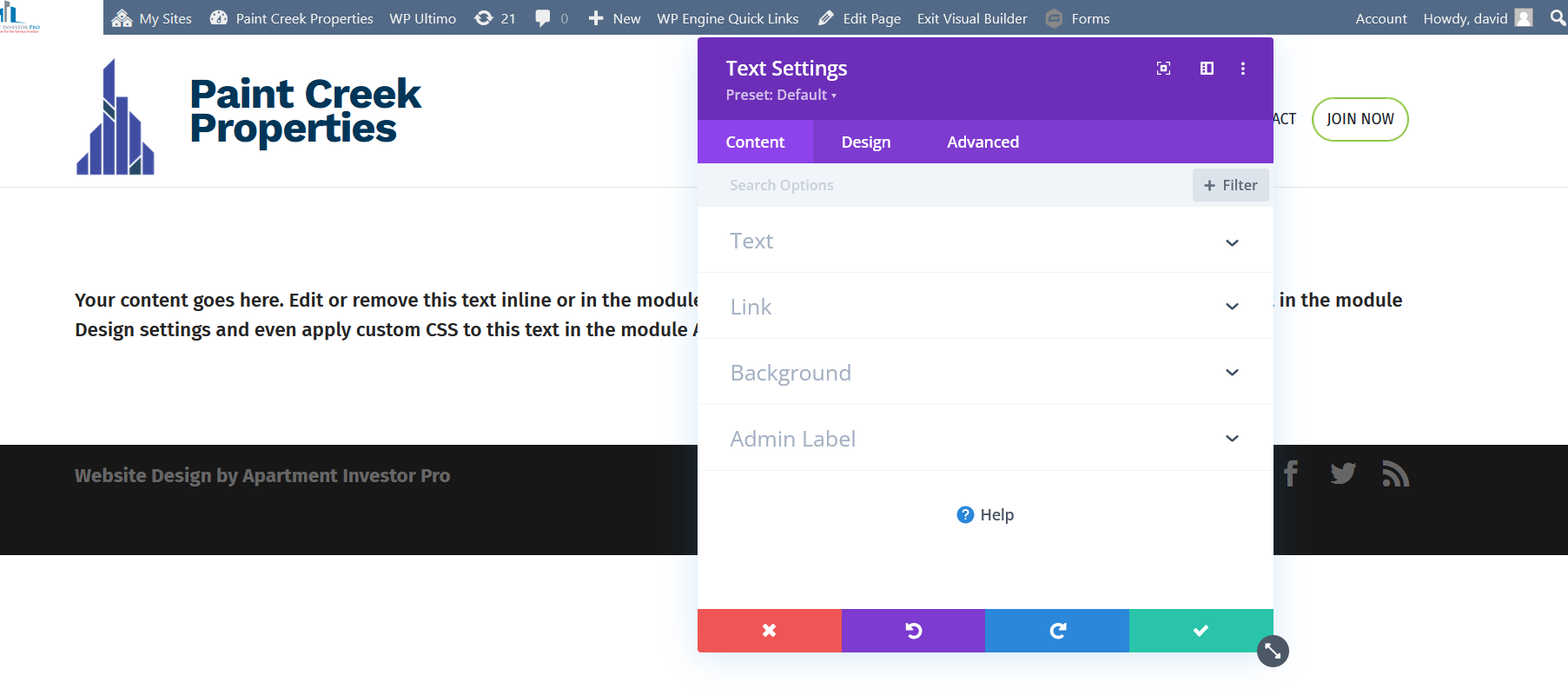
Continuing down you’ll see 3 tabs, Content, Design & Advanced. You will probably find everything you need in Content and Design.
Content Tab

This is where as the title suggests you add the content you want in your Module. Just about every Module will have the same 4 options under content. Text, Link, Background and Admin Label. Some modules have other options that will be specific for that particular Module. Of these options, Text and Background are what you will use most of the time.
Text will usually vary from Module to Module however the principle is the same. Whatever text you want displayed will be inputted here.
The Background is pretty self-explanatory and will always have the same options. Four tabs give you the ability to add a background color, gradient, image or video.
Design Tab

NOTE: While most of the options here will vary there are a few that are universal. And we’ll discuss in further other options in the tutorials that cover those Modules
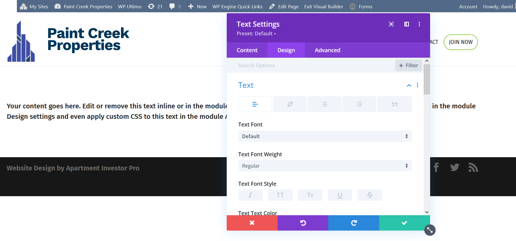
While you’re given a handful of styling options within the Content tab, the majority of your styling will be under the Design tab.
The first option, Text is similar to Text under the Content tab. So why is it there then? The choices here are universal for Modules that have the option to add text. Some of these are:
- Choice of Font
- Precise Font Colors
- Letter Spacing
- Line Height
- Text Shadow
The following tabs under Heading Text are rather self explanatory. They allow you to add styling around your text like a border or some shadowing. However the Sizing option is a little bit different, as it has nothing to do with the font size. Rather this option allows you to view your paragraph on different screen sizes and then adjust the width of your paragraph accordingly if you so choose.
Saving, Undoing, Redoing & Deleting
Once again every Module is exactly the same when it comes to Saving, Undoing, Redoing & Deleting.
So if you get yourself into a situation where you’ve made a mistake or do not like the look of something, the Visual Editor makes it easy to go back. You can undo/redo your work by clicking the purple or blue button at the bottom. If you’re just experimenting to see how something will look or really do not like the look of what you did, simply discard all changes by clicking the red box. When you are sure you are satisfied, simply click the green box.
When you like the changes you’ve made and are ready to save simply click on the green arrow which will save your changes. It’s important to know though that these changes will not be visible on your website until you close the Visual Editor.
