Buttons are used throughout all of Apartment Investor Pro’s design options and for the most part will not need to be changed. However, at some point you may want to edit the color of a button or even add a button to a new section. In those instances knowing how to use the Button Module can be very useful.
This article we’ll show you how you use the Button Module to add a new button and those same skills you can use to edit existing buttons.
Adding a Button
So let’s say under the section ‘What We Do’ you want to add a button that says ‘Learn More’ which will take users to a page on your website where they can learn more about your company.
For the example, let’s say you want to add it under the block of text. We’ll first need to enable the Visual Builder and click the grey ‘+’ button under the block of text.
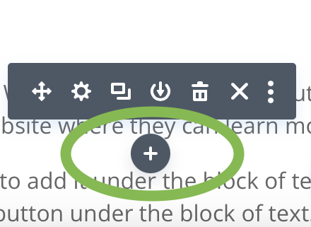
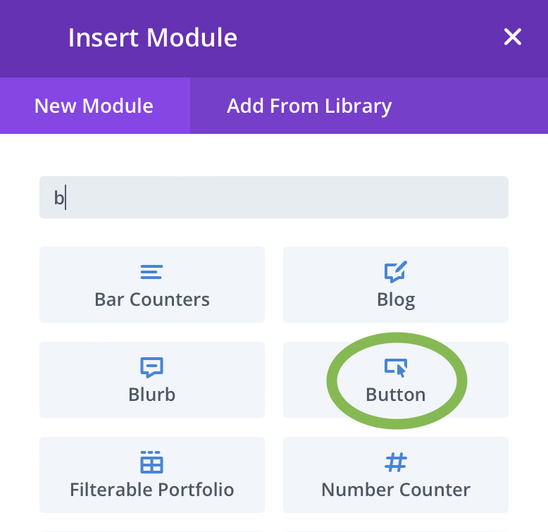
Once you’ve clicked the ‘+’ icon a pop-up will open with all the Module options available to you. Click the option that says ‘Button’. This will add a button to the page.
NOTE: By default the button will say ‘Click Here’ and will have default styling applied to it.
Editing The Button Content
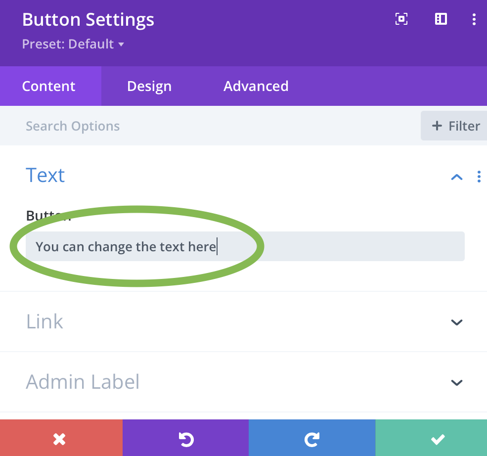
Now that you have a button on the page we need to add a link and change the text to better suit our needs. Like any module you add the settings will automatically open for you.
Under the Text option you can change the text of the button to ‘Learn More’ or whatever you want it to be. Below the Text option you have an option called ‘Link’, here is where you’ll add the link you want to use.
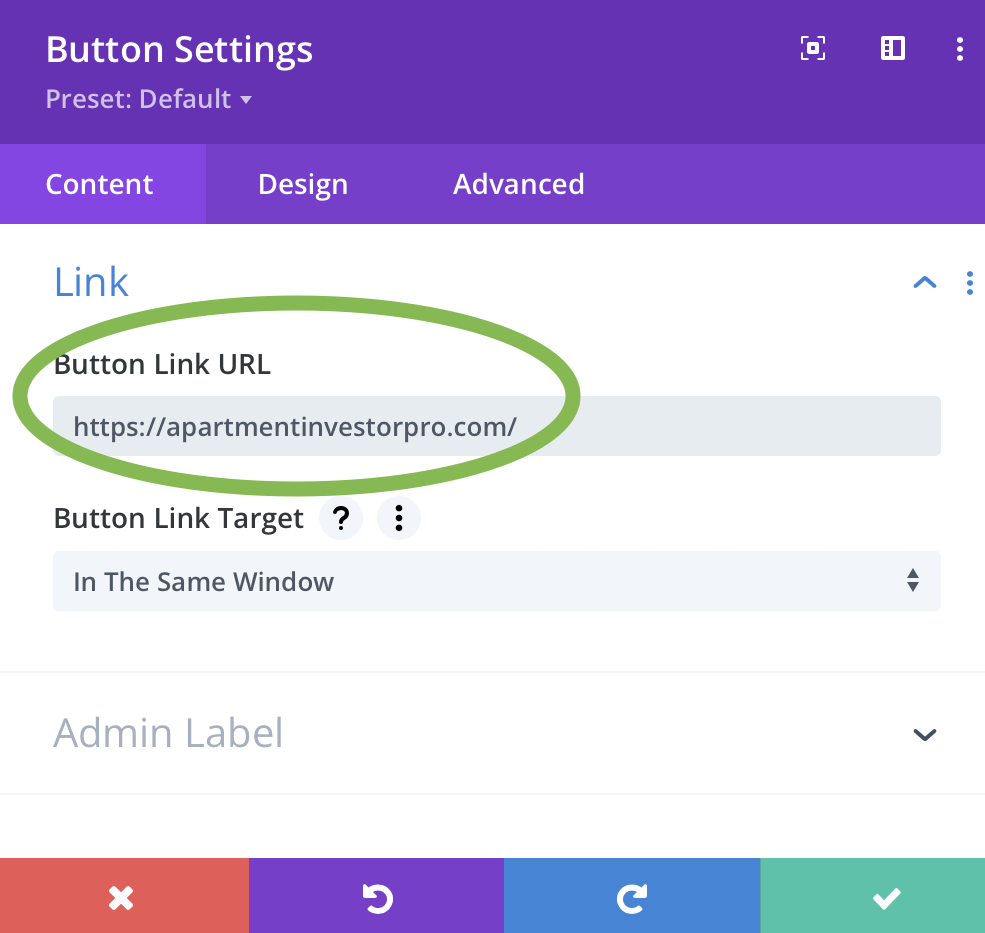
Some Things To Note: Selecting ‘New Window’ in the Target field will open the link in a new browser tab. When adding a link that goes to another website, this is always the best option to choose. If the link goes to another page on your website you can choose ‘None’ which will keep the visitor in the same browser tab.
Editing the Button Design
If you like the default design of the button then you can stop here, there is nothing more for you to do except save your work and close the Visual Builder. If you want to know how to change the design then keep reading.
Once you have the button content how you like, navigate the to Design tab which is found near the top of the Settings box.
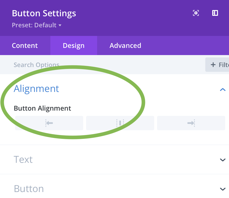
The first option will be Alignment. This will give you the option to align the button to the left, center or right.
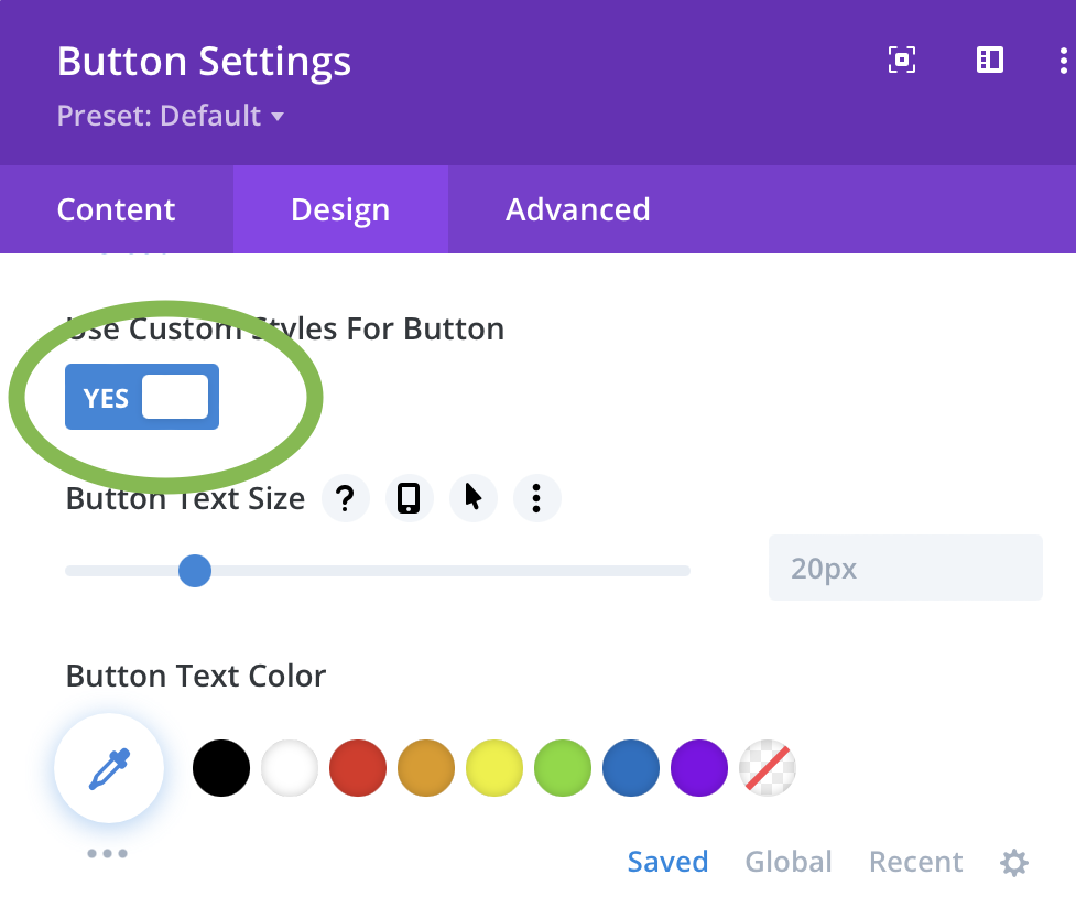
Where most of the design options you’ll want to use will be located where it says ‘Button’. By default these options will be turned off.
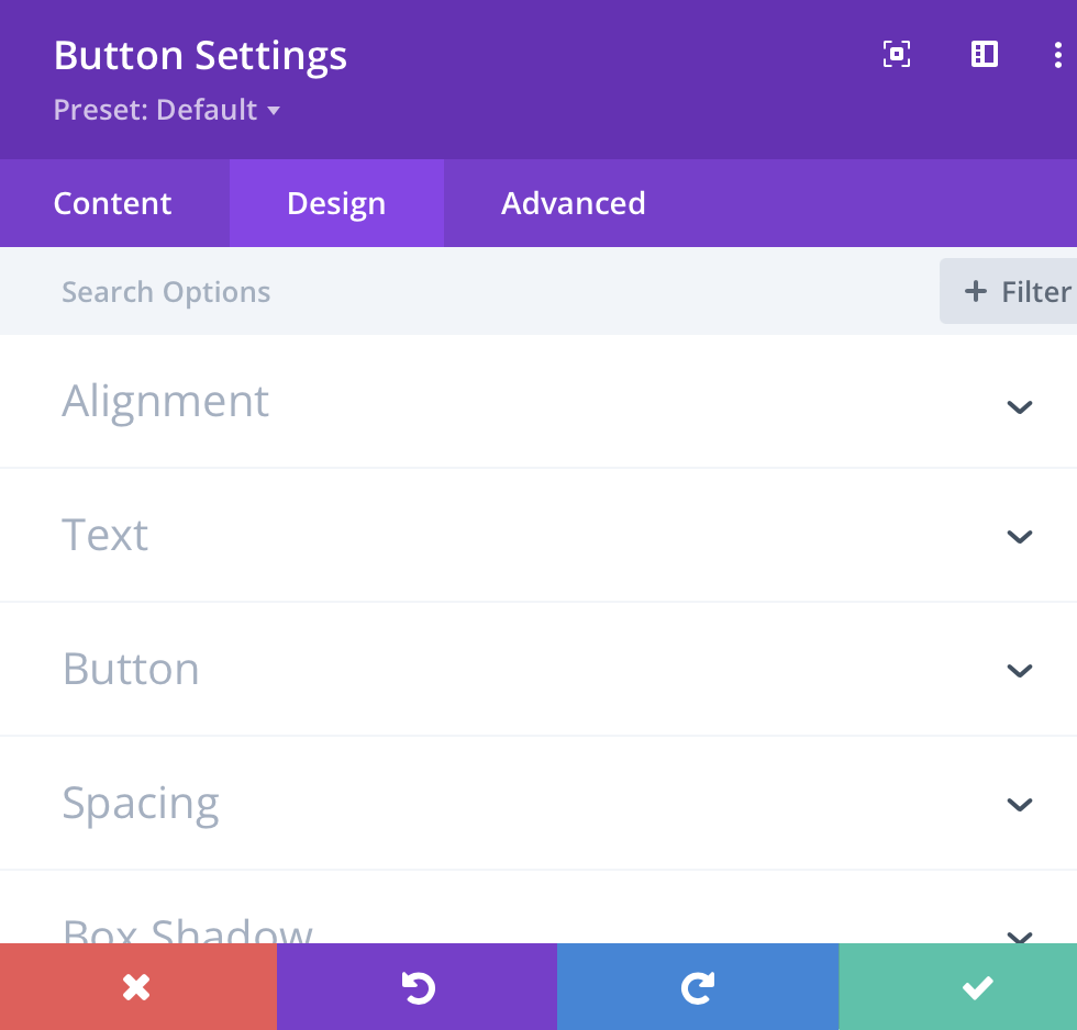
Once you click the button to ‘Yes’, the window will expand revealing even more design options. We’ll be taking a closer look at these options so you know what each one means.
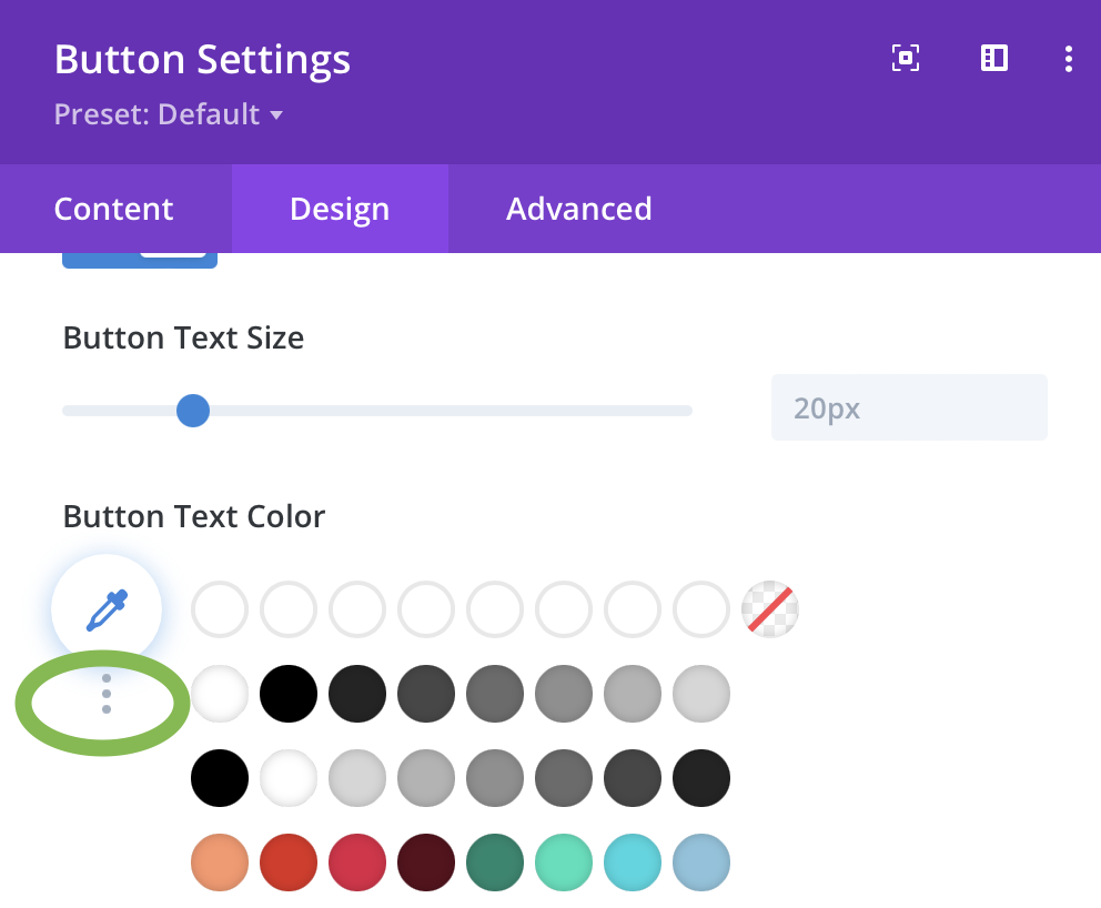
The first settings you’ll see will be to adjust the color of the text. These settings work the same way across ALL Modules. There is a row of saved colors you can choose from or you can click the eyedropper icon for more options.
For the Background color, again you’ll have saved options or you can click the ‘the three dots’ for more options.

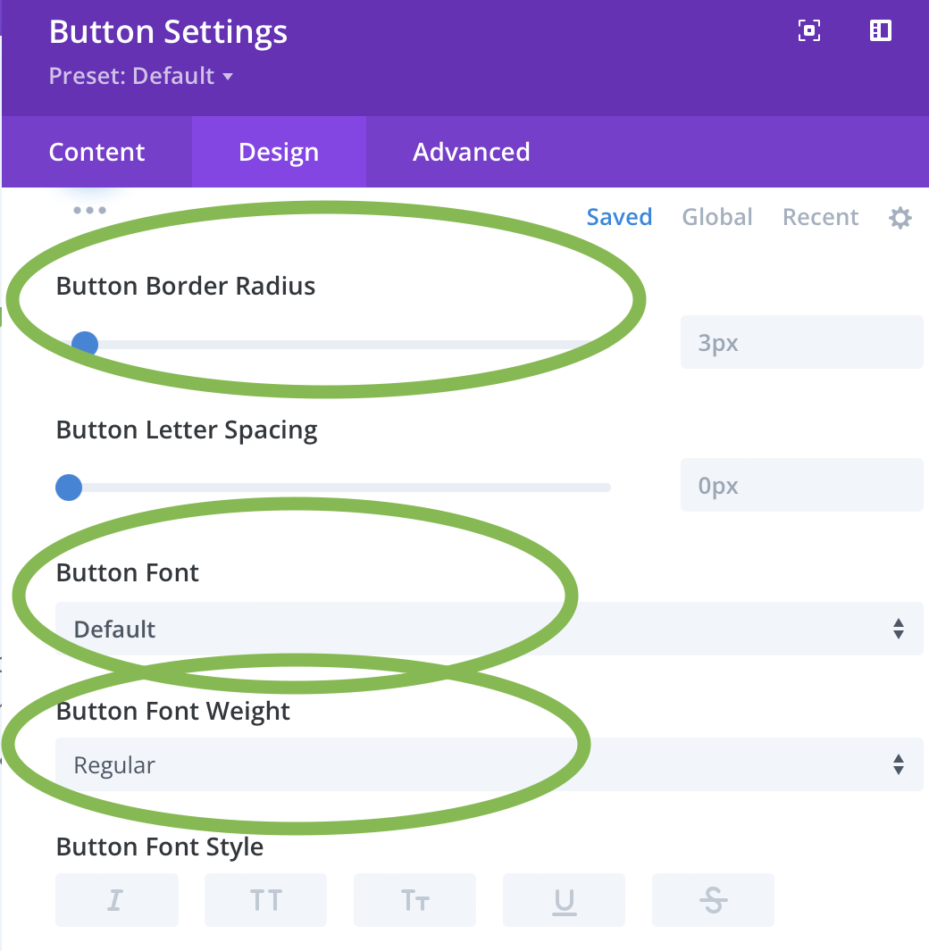
Scrolling down further below the color options are more editing options. We’ll go over in further detail the more common settings.
- Border Radius – Adjusts how round the corners are. Lower number = more square button. Higher number = more circular button.
- Button Font – Allows you to change the font.
- Font weight – Change the font from thin letters to bold.
Scrolling further down you’ll find options that allow you to add icons to your button. There is a large Library of icons you can choose from and below this you are able to change the color and placement of the icon you choose.
By default the icon will only appear when someone hovers over the button. This can be changed in the settings.
NOTE: For demo purposes I adjusted the style of the button so you can better see the icon.
Additional Button Style Settings
Finishing off the settings available we’ll be leaving the ‘Button’ section and scrolling down to ‘Spacing’ and ‘Box Shadow’ as these give you some unique ways to create some cool buttons.
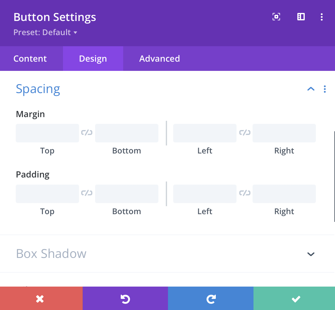
Under ‘Spacing’ you’ll see two options for Margin and Padding. While the options for both are the same they effect 2 different areas of the button.
Margin will create space around the button, so if you want there to be more spacing between the button and the text above for example, you can add spacing in the field that says ‘Top’.
Padding gives you more space between the button text and the border of the button. So as you can see if added padding to the left and right of the button along with the top and bottom, which in turn creates a larger button because the space between the text and the button border has increased.
NOTE: Selecting the ‘link’ icon between Top and Bottom or Left and Right will link the two together. Meaning if you link Top and Bottom as you adjust Top it will automatically apply the same amount of spacing to the Bottom.
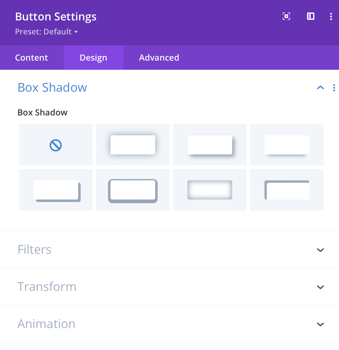
The last setting to take note of is Box Shadow. This simply adds a shadow around your button that can give it a more 3D look. There are different styles available that give you different looks. Each style gives you the option to adjust the Vertical and Horizontal Position of the shadow along with the color.
If you have any questions or require some assistance with adding or editing a button, feel free to contact the support team.
